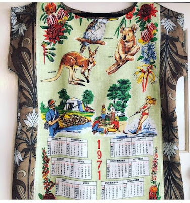
One of Middlemost's delightful garments (image source their website https://www.middlemost.com.au/)
What is it about this aesthetic that appeals to me – and many others - so much? The nostalgia aspect of ‘retro’ is obvious for those of us who remember the styles of past eras, but how do we explain why people not around when ‘flower power’ and Gordon Fraser greeting cards were in their heyday still rejoice in items that use or evoke these styles? Of course good design will endure, or be rediscovered regularly. As a William Morris fan I may be biased, but I don’t think his designs have ever experienced holus bolus rejection, even in the face of staunch minimalism. Of course art nouveau and Liberty’s enjoyed a huge revival in the 1970s but they are still regularly rediscovered and introduced to new audiences. Going rural in 2014, I was surprised to discover that shirts using Liberty’s fabrics are frequently paired with moleskins by ladies of the squattocracy!
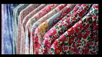
Liberty shirts (image source http://fashiongear.fibre2fashion.com/)
The old ‘I wouldn’t hang it on my lounge room wall’ test about whether a piece of art is something you could live with has some validity when it comes to choosing the patterns and motifs we use for decor or wear. I was shocked once by a Facebook post of an affluent middle class family sitting down to dinner in front of a reproduction of Picasso’s Guernica. I didn’t think ‘wow, how edgy’ - rather I was unsettled that a work commemorating fascist atrocities could provide a back drop for the evening meal. Unless you live in MONA it is usual to want to feel a degree of comfort with your furnishing and fashions. Though personally I wouldn’t eschew all of that gallery’s holdings, Judith Lucy’s labia would be welcome on my walls!
So what makes retro comforting? Is it possible to feel nostalgia for design trends that pre-date your existence?
As a child I had a particular aversion to a teacup of my grandmother’s depicting a deep burgundy coloured rose in a hyper naturalistic lush style, a kind of Gothicised version of Royal Albert Country Roses (which I also dislike). I called it the ‘headache’ cup. Setting aside that I may have been rather neurotic, I found the motif depressing, it did not provide me with the pleasure I derived from my grandmother’s few pieces of art deco crockery with their sunny yellow, linear designs and from the cheerful fabrics mum chose for our clothes. A dress featuring golliwogs as jack-in-the box figures waving flags is embarassingly the only one preserved in a photograph.

The offending frock (author's family photo)
As the 1960s progressed, mum selected fabrics in the colourful and floral designs that characterised the decade and I happily embraced the style. She made we three sisters corduroy pinafores with tiny floral patterns in three different palettes: autumn/mauves/blues. I had a ‘twist’ dress in an emerald green striped material, with a deep ruffle around the hem that swished when I danced at birthday parties. A PVC ‘flower power’ mac with a matching hat became the most high fashion component of my pre-pubescent wardrobe (and of any other phase of my life since). I used to pray for rain so that I could wear them. I treasured my pyjama case doll with her woollen hair sprouting from a mop cap and saggy (when not stuffed with pyjamas) body of paisley fabric.
Apart from these playful aspects of 60s fashion, prehistory and Egyptology influenced our home décor. We had a wastepaper bin featuring a photographic reproduction of bison from the Lascaux caves and wallpaper in the loo depicting scantily robed female dancers and musicians based on a mural from the Tomb of Nebamun. Surely their copyright-free status was not the only attraction of these designs.
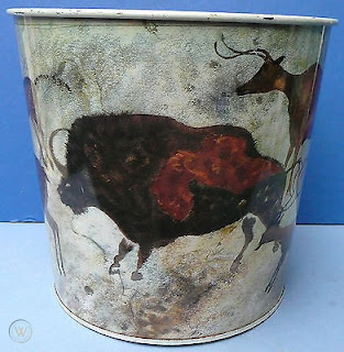
Lascaux bison on a wastepaper bin (source https://www.worthpoint.com/). We should have hung on to it - they're collectible now!
Long before I came to understand cultural appropriation my family had place mats with Aboriginal designs on them and I baffled my teachers by using the words ‘bunyip’ and ‘dugong’ in my compositions. I wasn’t much more enlightened in the 1980s when I copied turtle totems for a screen print design. But with hindsight the Jindyworobak movement thought 'progressive' in the 1940s, is being reassessed as naïve and even complicit in misinterpreting and exploiting Indigenous culture.
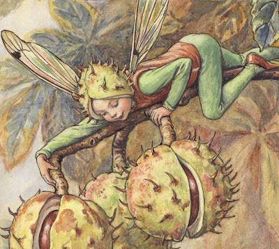
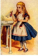
Other motifs and patterns encountered from childhood to the more recent past that continue to evoke powerful associations and, to borrow a phrase from Marie Kondo, ‘spark joy’ are Beatrix Potter’s and Molly Brett’s anthropomorphic animal characters, Cicely Mary Barker’s Flower Fairies, Arthur Rackham’s and John Tenniel’s illustrations to Alice In Wonderland, E. H. Shepherd’s to Winnie the Pooh and Harmsen van der Beek‘s to the Noddy books.
While I was rather blasé about the Theban Necropolis–inspired wallpaper in our lavatory, I responded with awed delight at wallpaper in the bathroom of a house our family considered buying. Pink flamingos grazed for krill amongst green reeds on a black background. It was the chic-est thing I had ever seen and I wanted my parents to choose that house. But while I quite like that colour combination to this day, I wouldn’t swoon sentimentally if I saw the design reproduced now - it was hopelessly kitsch!
The Horse Chestnut Fairy, Flower Fairies of the Autumn, Cicely Mary Baker (source https://gardenmuseum.org.uk/)
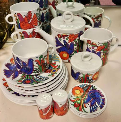
As Cole Porter observed, Whistler's mama and Inferno's Dante remain 'the top' whatever the vicissitudes of fashion! Then some things have such fond associations for us that seeing them again will always elicit feelings of comfort and joy. There seem to be ‘acquired memories’ that enter the canon too. I didn’t discover Florence Broadhurst’s designs or May Gibbs’ gumnut babies until decades after their genesis but they conjure the same reaction in me as my earlier discoveries. Sometimes, however we fail to appreciate the birth of a classic. While I have spent a small fortune collecting pieces of Midwinter’s Spanish Garden design crockery because I adored a cup and saucer in that design I owned growing up, I kick myself for not investing in a complete Villeroy and Boch‘s discontinued Acapulco dinner set in the 1980s. The rebooted version is exorbitant and inferior.
I have saved the overused ‘i’ word, iconic, unil now. For me most of the designs and images I’ve mentioned here are iconic and I would also include Ladybird and Little Golden books, the Michelin Man and Aeroplane Jelly swing girl, those Amsco decals you used to see on nursery furniture, Toulouse Lautrec’s posters and Ron Campbell’s Beatles animations. These things delight in their own right and how much greater the frisson when they are skilfully combined in a nice frock or via my own rather special interior decorating style!
But does the same effect occur when the style being recaptured or celebrated precedes your own living memory? If my parents enjoyed cave paintings and Egyptian murals, which were slightly before their time, and the Victorians loved a bit of medievalism in their architecture, perhaps we can all enjoy the exoticism of past styles… Maybe a bit of morphic resonance or collective unconscious is at work as well.
The Acapulco dinner set I wish I'd bought when it was discontinued and being sold on clearance at Prouds in the 1980s (image source https://www.liveauctioneers.com/)
Amsco nursey decal - we had a design like this on our wardrobe (image source eBay)
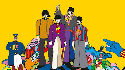
An iconic image from Yellow Submarine by Ron Campbell (source https://www.vogue.fr/fashion-culture/article/how-the-beatles-yellow-submarine-colored-pop-culture)
2 comments:
Like most people in their declining years, I've become much better at avoiding temptation. There are times, however, when a winsome piece of design captures my attention. So it is this very simple, but so so Arts & Crafts piece of Liberty pewter currently up for auction in Sydney. Though I have no need for it, if it comes in at the right price (ie nobody else bids on it and it mewls dejectedly at the opening bid like an abandoned kitten), I may be inclined to rescue it. https://www.theodorebruceauctions.com.au/auction-lot/archibald-knox-for-libertys-tudric-pewter-tri-foo_2C246A4B53
Archibald Knox is a favourite of mine. That is a rescue kitten worth considering!
Post a Comment